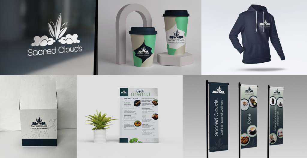
This project involved the full brand identity design for Sacred Clouds, a cannabis dispensary, café, wellness, and lifestyle store based in Melrose.
The goal was to create a brand that feels natural, elevated, and welcoming. Balancing wellness cues with a modern café aesthetic. The identity needed to work seamlessly across physical touchpoints, from packaging and merchandise to in-store signage, while remaining flexible and recognisable.
All brand assets were designed with consistency and longevity in mind, ensuring Sacred Clouds could scale across retail, hospitality, and lifestyle applications without losing its core identity.
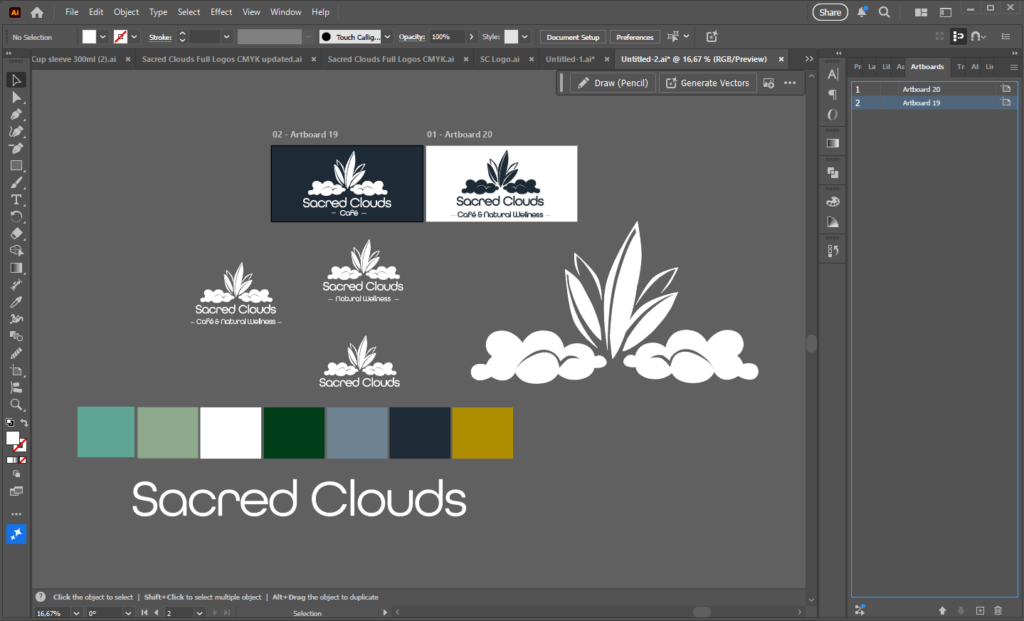
Logo Design
The Sacred Clouds logo was designed to feel calm, organic, and refined. Soft cloud forms paired with clean typography create a sense of balance between nature and modern wellness.
The mark was built to function across multiple use cases. From signage and packaging to apparel and digital. Maintaining clarity and impact at both small and large scales.
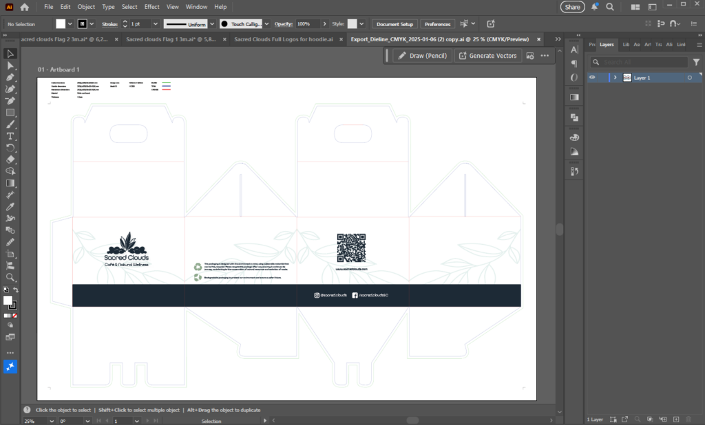
Packaging & Hoodies
Packaging and merchandise were designed to extend the brand into tangible, everyday experiences.
Takeaway boxes, cups, and hoodies use a restrained colour palette and minimal graphic elements, allowing the logo and brand forms to remain the hero. The result is a cohesive, premium look that feels both lifestyle-led and functional, reinforcing brand recognition across customer touchpoints.
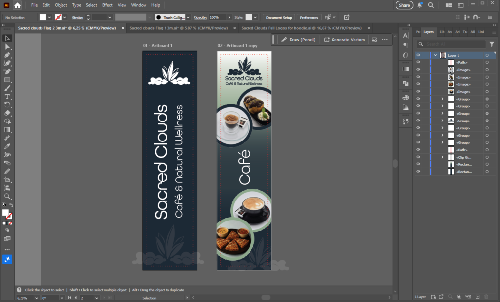
Flag Banners
The flag banners were created as high-impact, vertical brand statements for exterior and in-store visibility.
Bold layouts, clear typography, and strong contrast ensure readability from a distance, while still aligning with the softer wellness tone of the brand. These banners act as visual anchors, drawing attention without overpowering the environment.
Tools Used
Adobe Illustrator – logo design, packaging, apparel, banners